ASS2 - Project 3 - Architectural illustration
A needed break
I thought I should do a little write up here to explain and to help me to continue with this wonderful course.
Due to a car accident last July and then being busy with my art business for my Paper Pawtraits I have ended up having 5 months off - it was a really tough decision at the time but I was at a point in
my life of change and getting back up on my feet. It has been a very busy time and I looking back I
definitely made the right decision. I am now feeling refreshed, well and eager to get back into my degree. Looking back at what I have done so face in Illustration 2 is not as on point as I would like it to be so I have decided to continue from where I am and if I have time go back and redo some of the parts where I know I could do better. I have really enjoyed studying t the OCA and I have missed experimenting and discovering my style and who I am as an artist. I hope this year to continue my ambition and also enjoy the journey. It's hard getting back into something but I am going to push myself as I know I will regret it if I do not continue. This year is also a big year but in an exciting way, I am moving into my first owned home in the next month or two and in September I shall be getting married. This year is my luck and happiness year so I cannot fail!
Here's to 2019 fresh start new me and let's enjoy learning again!
Architectural Illustration.
Research Point
Some are driven by the ideas that drawing and illustration offers, others by the ideas inherent in the architectural styles they are representing.
Look at a range of different architectural illustrators and identify how their choice of drawing approach, perspective and materials relates to the architecture itself. These choices might support the underlying ideas behind the buildings, for example, glossy images used by a developer to suggest the idea of luxury. Or you might find examples where you think illustrators have used approaches that seem at odds with the spaces they’re representing. Pick a range of examples and write a short critical statement (50–200 words) on each of them outlining your observations.
What is an architectural Illustration
An Architectural illustrator is someone who illustrates buildings and their surroundings. They accurately portray designs and ideas for architectural projects. They use a 2D or 3D dimensional form to create their ideas and concepts. Software such as Google Sketchup is well known in this field to produce their designs and ideas. Usually, technical draftsmanship and precise use of visual perspective are often the main rules in architectural illustration however there are also some architectural illustrators who go for a more impressionistic style. Model making and digital are some ways in which they portray their ideas as well as traditional methods such as watercolour and technical drawing.
There are different types of architectural illustration used for various ways to portray design to appeal to their clients such as below:
- Exterior CGI (2D Illustration)
- Marketing imagery (advertising using 2D Illustration and lifestyles to suit and appeal to a market)
- Photo montages (showcasing a CGI designed building and merging it into a real-life photo so the viewer can see the idea if the design and how it will fit in within the real surroundings it will be built in )
- Interior CGIs (2D illustration inside of a building, room or space)
- Lifestyle shots (advertise a way of living to appeal to certain people)
I am now going to look online and find some Industrial illustrators so look at and discuss their style.
David Brazier
http://www.sai.org.uk/member/davidbrazier/
The medium of choice: Watercolour


The colours are vibrant, which makes the illustrations crisp and fresh to look at. The illustrations on his SAI page are mainly countryside and townhouses surrounded by trees, hedges and general greenery landscapes
As well as 2D external styles he has also created illustrations of bird's eye views and interiors. His technique is very precise and you can tell he enjoys drawing areas which are showing the construction of a building as though he sees the structures as a highly successful design.
His building designs work well within the countryside landscape. This is because of the houses are
reflective of a barn style, based on how the houses point upwards and the use of sandy colours of the
bricks, The colours he uses alongside the designs on the buildings work well together to create a
countryside atmosphere to his work.
Alan Whittle
http://www.sai.org.uk/member/alanwhittle/
The medium of choice: Watercolour


Alan's style is very traditional using pencil, pen and ink as his chosen media. His style is very black and white which gives a traditional style to his work. His technique is to be as precise as possible in regards to proportion and perspective. As well as drawing external architecture his also sketched the initial construction in the building. He has done several drawings showing what is between the walls such as the insulation and the beans supporting the house. His style is great for developers to look at and understand how they want to construct the house.
Gillian Ross
http://www.sai.org.uk/member/gillianross/
The medium of choice: Handrawn to digital


Gillian has more of a modern style compared to the two previous architects I have just looked at. Her medium is the use of initial drawings and then converting them into digital images. She uses a lot of natural colours and the main colour she uses a lot is white. This makes the images look fresh and give that modern atmosphere to her designs. She uses people in her images to show what the lifestyle would be like to help the viewer grasp the idea of living. Her perspective is great and her designs of architecture are of a more designers way to look at a space. As well as designing the buildings to look appealing to today's people, she has also kept a clean and natural environment which contrasts with the wonderful architecture created.
John Pumfrey
http://www.sai.org.uk/member/johnpumfrey/
The medium of choice: Unique washed style


I came across Johns work and thought it was refreshing to see a totally different style to the 'usual architect'. It is more of an impressionistic style based on the colours used. His style allows him to be looser than the usual rules of perspective. The use of his watercolour technique suggests movement within his designs giving the viewer an impression of life. Although his work is more freely expressed, he has still been able to as perspective and in some areas used technical architecture details.
Countryside Properties (my place of part-time work)
(images for a designer at work who said I could use their images for my research)
I started a new part-time job in November as a receptionist at a big UK house developer called Countryside properties. It has been great working there as it has helped me understand architecture a lot more than I did. I understand its importance in our lives to suit our lifestyle and make sure buildings are built of a high standard to last and appeal to many people.
I have also learned that there are many things to consider as an architectural illustrator, not only are you designing the buildings for people to live in but you are also designing the area and the rooms within the houses as below:


They have to think of how the area is going to look, how to fit the roads together to fit the number of houses the developers want and how to use the space around and in the buildings. In the area, they want to make sure the people who live there have the best of life such as a park, shops, schools and much more.


The designers at Countryside use the latest CGI technology to design their buildings and to show a way of living. What I have learned is that they also sometimes use real photos of the development site and then with the software they merge their buildings into the image. This helps viewers to vision what the area will look like with the new buildings in it. The CGI images also include people and transport to help people visualize what it would be like to live there. It is a very modern style, personally, I prefer the traditional mediums looking from an artists point of view. However I can imagine, if I was buying a house from them these realistic images would help me picture a very close idea of what it would be like.


Paper Artist Who make building models
Sam Pierpoint
http://www.sampierpoint.com/about/


Sam is an amazing paper artist. She uses my fav medium to create worlds of wonder. She can be given a theme or use her own imagination and create cities and landscapes all out of paper. She uses a paper cutting machine which has software to help design and create here masterpieces. Her work has become well known in England in the last two years. Her works of art are usually used for marketing products, places and services. Paper creates a unique style, it creates depth with the 2D and 3D aspect of her work. After all her hard work putting it together she then takes photos and uses photoshop to add backgrounds, make colours more vivid and add more depth where needed. I think she has got her style to a level in which it has that wow factor and you can recognise it is her work.
Zim and Zou
https://zimandzou.fr/about


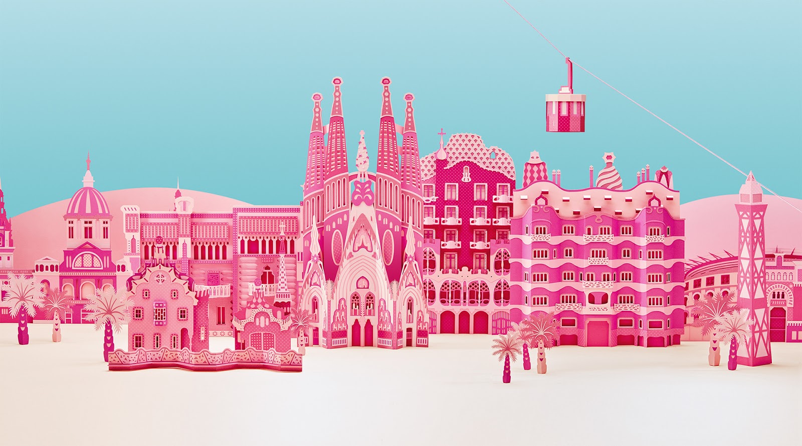
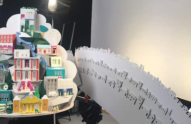
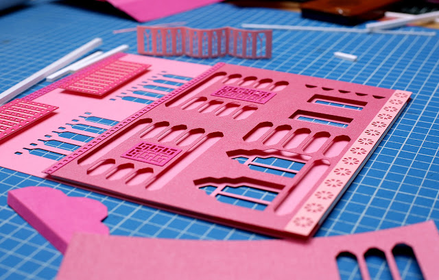
Zim and Zou are a duo, they are in my top five artists around today. They work together as a team to create some extraordinary forms of paper art. Within their art, they have done quite a few paper models of buildings as the photos show above. I love the Barcelona city theme project they did. They looked at the main key buildings in the city and turned them into paper form. Their colour choice is also an interesting topic, they have only used one colour but by using various tones of pink they have added depth and detail to their work. These artists use a knife to cut everything out without using a paper cutting machine. It's amazing to think all of this intricate work is cut out by hand to make such amazing art. They are very precise with the sizes of windows, the proportions of the buildings next to each other. Even though they are not actual architectural illustrators, they sure do think and work like them. With their clean lines, 3D shapes to create great models, whether its buildings or animals they look at its form from an architects point of view before they build their models to make a perfect paper construction.
Exercise: Architectural Illustration
Task - Create an architectural illustration that shows the contrast between a building or structure of your choice and its surroundings.
For this exercise, I have had a good think about what I would like to do and thought about what is around my area in reach to do a project on. Birmingham
My plan to go to Birmingham and take photos of around the city and decide on a building which contrasts with its surroundings,
My best Photos of Birmingham


My Thoughts of Relationships between new and old buildings.
I had a great day out trying to capture the best shots I could. There are so many interesting angles to take photos around the city of all old and new buildings side by side. I discovered that I actually see Birmingham as a cool modern city compared to when I was a child. Back then it was more chunky dull stone buildings compared to now where modern buildings are using colour to brighten areas up.
In my personal opinion, a mix of modern and old architecture together gives great character to any city. In one way we want to respect the past by keeping historic construction but also create our own new ideas, to provide a worthy legacy of our time here, just like the architects before us. Using the latest materials and technology we have today can provide a better way of living and improve things such as energy performances and be kinder to the environment.
Here below is a very useful link below to show my understanding of old and new architecture contrasting to one and other:
https://www.theguardian.com/cities/2016/jun/09/old-v-new-architecture-pictures-incongruous -city-buildings
My Chosen building - Birmingham Library
Out of the day my favourite part was taking photos of Birmingham's new art gallery. Here are some photos below:
(Please note some are mine but the aerial shots I have taken from
http://www.morrisroe.co.uk/portfolio/library-of-birmingham/
this is to get a better view and see the building's surroundings better than I could on foot.)


The Design
It is an unusually beautiful building which is very striking and a recognizable icon in Birmingham. Birmingham Library is mainly made out of concrete, metals and brick and glass The main colours are Mecanoo Blue, gold, grey and black.
The building is made up of a stack of four rectangular volumes, which are staggered to create various canopies and terraces. It has a sunken amphitheatre, rooftop gardens and a shimmering facade external with interlocking metal rings.
Francine Houben designed the exterior of the building to reference the city's jewellery quarter, adding a filigree pattern of metal rings over golden, silver and glass facades.
Inside, these rings cast patterns of shadows onto the floors of the reading rooms in the middle levels of the building.
"I didn't want to make a brick building, because we needed a lot of light, but I didn’t want to make a glass building either," architect Francine Houben told Dezeen. "It's so beautiful to sit inside because of the reflections and the shadows, and the changing of the weather. It's different from December to June." ref Francine Houben 2016
To help with the environment - The library uses an aquifer ground source system to reduce energy consumption. Cold groundwater is pumped up from within the earth and used in the air conditioning system. The water flows back into the ground via another drilled well. The use of groundwater as a source of renewable energy lowers the library's carbon dioxide emissions.
The new library was designed by architect Francine Houben. It was opened to the public in 2013. The library is known as Europe's biggest library and contains over 315,000 books inside.
Here below is an image of the original library which was is the same spot until it was brought down to make way for the new vision.


On the opposite side of the library, you have the Birmingham Repertory Theatre, commonly called Birmingham Rep or just The Rep. It is a producing theatre based on Centenary Square in Birmingham, England. It is the longest-established of Britain's building-based theatre companies.
I could not find much information about the history of this building online. Looking at it I can notice that it is made out of glass and cement. The windows are square and also curved around particular edges, to give the look of archways all around the building. This is to perhaps help to give the building a typical look of a theatre style. The building is mainly grey and black, the only added colour is on the top where the REP logo is. Sitting next to the Library this building contrasts well with its archways complimenting the inter-locking rings around the library. Again like the Baskerville building is it dull against the vibrant Library, yet this building has a retro personality to it.


The Library is situated in Centenary Square which is surrounded by a black pointy iron fence. The landscape around the library has been modernised with greenery, light coloured pathways and a below the ground is an open top amphitheatre, which you can look down in to, it's great when there is an event on and you can see the shows below. The landscape is very different next to in neighbours with just plain brick pathways and not much greenery at all.
Around this area, you can also see skyscrapers which fill the city. Mainly in this area behind the library are four standing skyscrapers all the same design next to each other. These I discovered are accommodation for students which is ideal for them being right next to the library. Beyond that is greenery - you can actually see the farming fields in the far distance beyond the houses.
To help with the environment - The library uses an aquifer ground source system to reduce energy consumption. Cold groundwater is pumped up from within the earth and used in the air conditioning system. The water flows back into the ground via another drilled well. The use of groundwater as a source of renewable energy lowers the library's carbon dioxide emissions.
The new library was designed by architect Francine Houben. It was opened to the public in 2013. The library is known as Europe's biggest library and contains over 315,000 books inside.
The Old Birmingham Library
Here below is an image of the original library which was is the same spot until it was brought down to make way for the new vision.
https://en.wikipedia.org/wiki/Paradise,_Birmingham
Birmingham Library - Surrounding Neighbours and Area
The Baskerville House
Birmingham Library is a beautiful modern building. It is colourful which brightens up its surroundings. It is a modern building which is situated next to a building called the Baskerville House, which is an early 20th-century build. Back in its hay day, the Baskerville House use to be the main civic centre for Birmingham. When they were looking for a new home for the library they thought the Baskerville House would have been great. However, after many checks, they decided that it was deemed to not be suitable as it would not be strong enough to hold all the books.
The Baskerville House has been made from Portland stone and bronze. The stone makes the building look strong and of importance. To enhance the building there have been pillars put in place. They are tall and are at the front and at the sides of the building. This helps to make the building look bigger than it actually is. The building also has a big archway at the front near the top of the building, which enhances the building's superior.
The Baskerville House has been made from Portland stone and bronze. The stone makes the building look strong and of importance. To enhance the building there have been pillars put in place. They are tall and are at the front and at the sides of the building. This helps to make the building look bigger than it actually is. The building also has a big archway at the front near the top of the building, which enhances the building's superior.
The Rep
On the opposite side of the library, you have the Birmingham Repertory Theatre, commonly called Birmingham Rep or just The Rep. It is a producing theatre based on Centenary Square in Birmingham, England. It is the longest-established of Britain's building-based theatre companies.
I could not find much information about the history of this building online. Looking at it I can notice that it is made out of glass and cement. The windows are square and also curved around particular edges, to give the look of archways all around the building. This is to perhaps help to give the building a typical look of a theatre style. The building is mainly grey and black, the only added colour is on the top where the REP logo is. Sitting next to the Library this building contrasts well with its archways complimenting the inter-locking rings around the library. Again like the Baskerville building is it dull against the vibrant Library, yet this building has a retro personality to it.
Landscape


The location
https://www.alamy.com/stock-photo-aerial-view-of-the-library-of-birmingham-in-centenary-square-birmingham-112215333.html

The Task at Hand
Sketches of library and neighbour
To get a better understanding, I am now going to go back to Birmingham and make sketches of both buildings to get the feel for their personality and the contrast to each other.
Birmingham Library


Above: Created using pens and pencils
I have sketched various angles and details which I think are important and shows the character of the building. The library, when stripped down to its basic form, is made out of rectangular blocks piled differently on top of each other. with a cylinder tilted at the top.
On the surface of these shapes, there are two layers of metal interlocking rings which cover every surface apart from the cylinder at the top and the very bottom rectangle area. On top of the rectangles are small neat gardens to add more greenery to this area and it makes it a very pleasant place to read the books from the library. To me, the library looks like a pile of books piled on top of each other and I think this portrays its character and the buildings meaning very well.
As well as the sketches I also decided on making a small model out of paper of the Library:

I think this helped me to grasp the layout and the construction of the building well. I also crested interlocking rings and used my paper cutting machine to cut them out for me.
Baskerville House

The Baskerville house is very different from the library when simplified down, its basic shape is just one big rectangle, compared to multi different sizes and shapes like the Library. It is one big rectangle but this does not mean it is a simple building. With added details such as archways and pillars and bordered concrete lines to neatly frame the building, it stands with a personality of looking superior, rich and proud. The building also has may windows making a lot of light accessible inside the building. The building is very isometric especially if you just put a line through it down the middle, you can see either side is the same. Compare this to the Library which has no in symmetry at all. This also helps to discover that the design of the library was also made this way to stand out and be different.
As I have thoroughly researched the Birmingham library and its surroundings I would like to show the contrast of itself - a modern building next to an older building such as the Baskerville (which is the oldest neighbour). I am going to write down some ideas and keywords to help me discover how I can do this creatively.
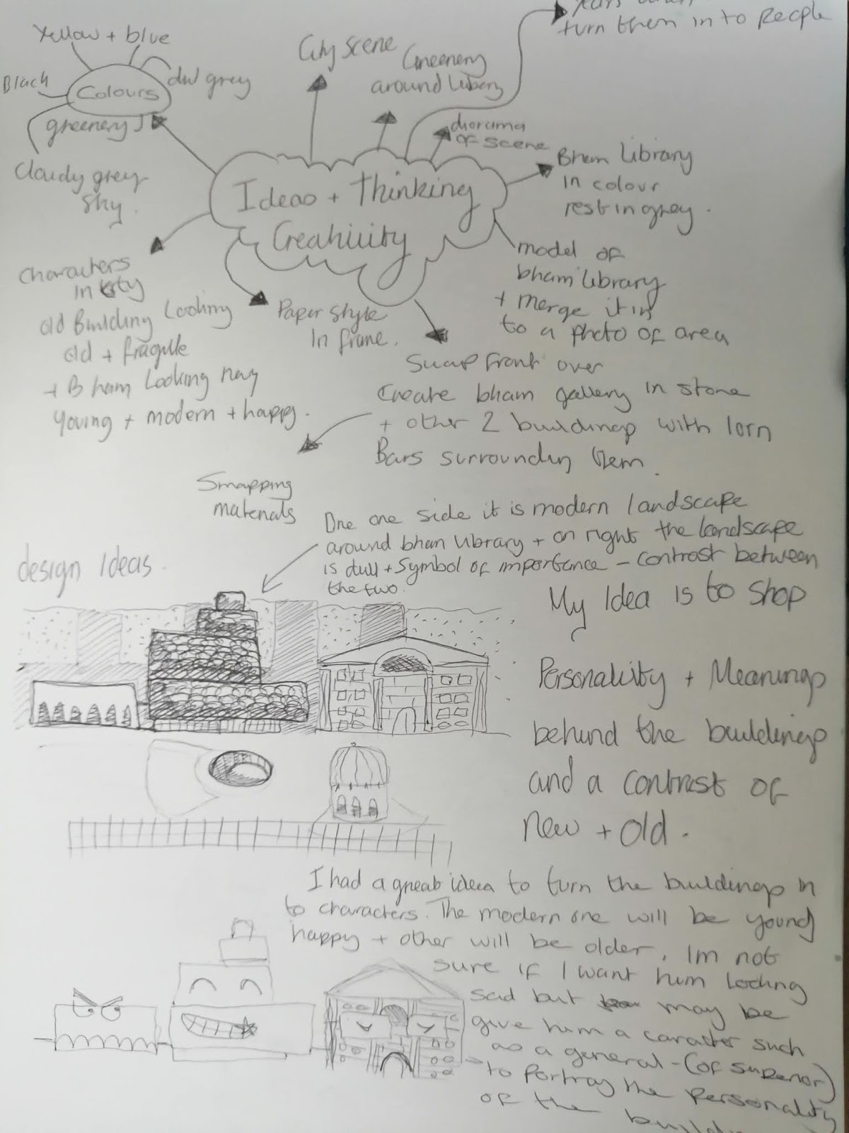
Keywords and thinking creatively

Out of the keywords, I think it would be interesting to show the difference between old and a modern building but also show each buildings personality and what each building is used for in Birmingham.
Ideas and further illustration sketches
After doing my sketches, thinking about my own personal style and taking on this task in a creative way, I have come up with a great idea to show the contrasts of the personality of each building by creating a scene with both buildings being cartoon characters.
I think my idea will suit this task well and has got me thinking creatively about how I am going to do this. I am now going to do some cartoon sketches to capture each buildings personality and look at colours to help me visualize my idea better.
Characters


Here above are my sketches. I really enjoyed experimenting with different ideas and I really think I came up with two great characters.
The Library is bright, happy and quirky looking to portray its modern look. I have also added on a graduate cap on her head to show what the Library represents, a place of learning and the potential to be great.
The Baskerville building - I have decided to use a character I designed that shows its personality of being a bit snooty and upper class. I have also added a ribboned crest to show wealth. As this was the old main civic building, I think the building should have a personality of someone in government, the mayor perhaps or at least someone with a title to show the importance of the building.
I would like him to be looking over at the Library as though he is huffing and looking over judging the library as such a ludicrous building. Back in the Baskervilles heyday, there would have not been anything quite like the library and I think it would have been seen as an eyesore to the city, especially standing right next to the Baskerville building which is a very serious and important place.
Scene

I have also looked at the layout and the scene that I want to show. I have decided to keep the main focus on the two buildings that I am comparing and keep the background very simple.
I want to include the four student flats in the background to help show the scene is in a city. I Also want to show the green fields far out in the background which is true as soon as you exit the city there is a lot of farming areas.
I am going to add clouds as tends to be very cloudy in England but also to show the smog of the city too.
In the foreground, I want to show that there is also a difference with the library surrounded by greenery and an amphitheatre below ground, compared to the Baskerville building which has a large bricked area in front of it.
Surrounding the two buildings is a black fence that goes around the whole square so I would like to use this to make the viewer feel as though they are looking over a fence to see the buildings beyond it.
Colours


From my ideas and sketches above I am very happy with this illustration that I have come up with as a rough idea. I am now going to draw this as a final draft illustration before I create it 3D out of paper (my own style).
Final sketch


Here above is the final sketch of my idea. I am happy with it. I think it's a fun and great way to portray the architecture creatively with my own style. Not only does my idea show the contrast between an old and modern building but it also shows their use to the public and their personalities.
Creating The Final Illustration Step By Step
I looked in my art room for inspiration as the illustration is quite long in length, which it had to be for my illustration design. I have many frames and found one which would be perfect for my illustration. I am going to look at my paper collection here and work out what colours I can get that closely match up to my draft colour illustration.


Here above are some photos I took of the colours I was matching up for the background. I am happy with my choices, they match up against each other well.


Here above I have finished the background. I have cut out and added in the clouds on a blue sky background. I have used pencils to add shading on to the clouds to give them a bit more of a texture and weight to them.

Above: My cutting machine.


I have also cut out the paper shapes for the landscape and the buildings in the background. I am not going to stick these down just yet. I am going to wait until the library and the Baskerville building has been created to make sure they are the right sizes and it all sits well together. With the 4 flats in the background, I am also thinking about adding windows to add a bit of detail, but not a lot of detail as I want to make sure the important buildings stand out.
Creating the Library


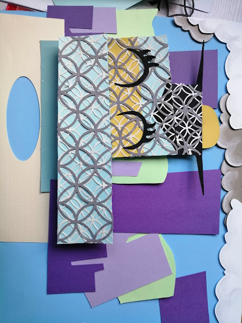


I have used my cutting machine to cut out the interlocking rings as this would have taken me hours by hand and would not look as neat. I have also cut out all the shapes and ready to glue it all down to create my character for the library. To build up the layers not sure if I mentioned earlier but as well as glue I am using think double-sided sticky tabs which help add layers and height to my work.
Where the library's smile is, that area of the building sticks out the most in real life so I have found some polystyrene and used this behind this area to really make it pop out. I can only get it so high with the double sided tabs so sometimes using different materials behind the scenes helps to give areas more lift.
I think my library is looking great I was going to draw around it using a black marker to give it the cartoon effect but instead found out that thin strips of black paper glued around the edges worked great. It was hard for me to draw the outline with a marker because of all the glued down interlocking rings. I did attempt it but it didn't look as neat as the paper lines.
I have also struck down some of the background around the library and I am excited to see how the Baskerville building will look like once it is created out of paper.
The Baskerville house


I really like how this building has turned out he is a really fun character and I feel I have really got his personality correct to the character and the design of the building. I again worked out all the shapes to build up the building and cut them all out. This time I used a maker to go around all the areas to make it a cartoon style. As this building didn't have a texture to it like the library it was easier just to use the marker.


Once finished I stuck it all together with the background.
I put more of a thicker backing (more height to the layer) at the top of both buildings to give a sense of tallness, as though you are looking up at them.
The Foreground


Once stuck the back and middle ground down and was happy with it I started the foreground. I added trees, pavement areas and the below ground amphitheatre. When working on it I thought it would also be a good idea to show the garden areas on the library so I also added on bushes of greenery on the areas where the gardens are ,which I think really finishes of the library well.


Now I am going to put it into the frame and add the fence on the outside of the frame to give it more depth For the fence I am using cardboard and I shall then paint it black with gold added detail. I will show this in the final illustration shots.
Finished Illustration and overview


Here above is my final illustration finished. it has taken me a while but having had 5 months off it has helped me realise that I love learning and experimenting. I have learnt a lot and I feel ready and eager to do more. My illustration has worked out very well, with taking time to research, sketch and experiment. I feel I have produced a very good illustration that shows how much work and effort I have put into it.
I love the colours together, it all sits very well and the buildings are fun and stand out well next to each-other. I think my illustration shows well the contrast between these two buildings and a fun way to show their personality. The fence was the finishing touch, it works well to make the viewer feel as though they are peering over the fence to see the buildings beyond it. Creating this out of paper was a challenge but it worked out wonderfully and brings the illustration to life.
I have below also had a play in Photoshop to make it an illustration that can be used digitally and edited it in a few areas to improve the illustration by cleaning unwanted marks away, using the sponge and burn tools to add more depth to shadows and highlights and generally just tried to improve it.


I think my overall image looks great my paper style has produced an interested style once edited in Photoshop. The burn tool really helped me enhance the shadows and created more depth. This is the only issue about my paper style I love it for its added depth but when it comes to seeing it on screen in a digital way the depth is taken away. I am unsure whether to accept this, master the tools better in photoshop to help improve or is there another way to enhance my layering? I am hoping to discover my answer to this overtime during this course to help me improve my work and push my comfort boundaries once again.
Have I shown the contrast well in a creative way?
Yes! I think by researching and experimenting it has made me create something which is different, my own style and has a very different way at looking at two buildings and expressing there contrast of their characters.
Final Thoughts of the contrast of the Birmingham Library and its surrounding areas
My overall opinion of the library and its contrast with the surrounding areas is that the Library gives this area of Birmingham added modern character. It has brightened up the square sitting in between two old grey historic buildings.
It helps to attract young people to the area who then also get to see all three buildings together and enjoy what is available to them. The buildings either side are built up in symmetry but the library has been built using differently shaped rectangles which helps it to stand out and makes it eye-catching.
Also with these 3 buildings next to each other it helps build up character within the city and side by side they contrast well together. The Library is of more superior visually because it is different but also at the same time making you appreciate the buildings next to it which were made with using their top technology and materials at their own modern time.


Comments
Post a Comment