ASS3 - Project 2 Image and Text
Research Point
Kafka’s short story The Metamorphosis (Die Verwandlung), first published in 1915, is a strongly visual tale of a man called Gregor who wakes up one day to find himself transformed into a beetle. The story then explores how Gregor and his parents deal with this transformation. The Metamorphosis is set in Gregor’s bedroom in his parents’ house, and the door of the room becomes an important visual metaphor for being trapped.
Research how different illustrators have tackled this story. You’ll find that there’s a limited range of images –
the bedroom door, the beetle and the bed.
How have illustrators used these elements?
Where in the narrative have artists placed the image – before, after or during the transformation?
How have illustrators’ choices framed your understanding of what the story is about? Which do you think is the most successful version?
To begin my research I have red the story and watched a video film to understand the concept, plot and meaning. I felt this will help me to break down chosen illustrations and discuss how people through creativity express their meaning of this story.
My opinion on the story - for me overall the book was dark, creepy and showing how humans react to things which are ‘gross’ looking. It shows hatred, fear and depression. It also had a sad ending for Gregg who dies at the end.After all his suffering being transformed into a beetle and then getting abuse and neglect from his family, he passes away, which brings joy and give back the family a future of happiness. I didn't really like the story, it's not something I would usually read, and I felt the ending could of been longer and maybe have Gregg talking about how hes now dead and watching over his family, just something to give his final opinion of his family.
I am now going to look at other versions and creative ideas which people have made to portray the story in their own opinion.
Films
Link 2 - https://www.youtube.com/watch?v=fHKk4GRquOY
Link 3 - https://www.youtube.com/watch?v=aE03VimkKZ8
Here above are links to films that I have found.
Link one: This helped me understand the story well. The artist had created a film which he uses illustrations, words and narrative to get the message across. It is of a simple style which clearly tells the story and is really easy to understand. I don't think much atmosphere was created or a creative way of looking at it. I just think the artist wanted to state the obvious for everyone to understand what the story is about.
Link 2 - Is a very surreal version where the narrative is expressed through the vision on Gregg who has woken up as a beetle. The video is clever as the creator is trying to make the viewers feel as though they are looking through Greggs eyes as a beetle and how things look around him. Everything is much bigger, moving faster and sound is sensitive. There are time music from a violin is played which create a sound you would relate to something creepy like and insect.
Link 3 - I think has to me my favourite link I found. In this short film it is all black and white no narrative apart from word on the screen but this time the music is telling the story - The music is created by a mix of string instruments and depending what the part of the story is about the music will go faster, slower and more screechy during dramatic parts of the story. It really made me get into it and enjoyed the film very much. The illustration in the video are line drawings again in black and white - They show Gregg as a but and how he is bound to his room. The music also portrays an atmosphere of going crazy and losing his mind being forced to stay and live in his room for some time.
Theatre
Link 1 - http://vesturport.com/media/pictures/metamorphosis-oslo-photos/
Link 2 - https://www.youtube.com/watch?v=4Y3izEP3o4Y
Link 1 - Here are some photos from a theatre production, I noticed that they didn't dress the actor up who plays Gregg instead in portrays that he's woken up and it's all in his head that he is now transformed into a beetle. This give the impression that Gregg suffered from mental health He could of been under a lot of stress from work and being able to make enough money to look after his family.
Link 2 - This was a great production, I couldn't turn it off.This is because the actor acting as Gregg was proper into character and his movements we bug like. There was also music and watching it made my hairs stand up. It was so chilling and they wanted to capture the story as a scary, horror version. The actor who played Gregg was also decorated in what I can explain as black paint on parts of his body. Their aim was to make him look grotesque as possible and they certainly did that! - He was also very flexible which meant he could get in to different angles and twists that normal people cannot do. It made him look odd, alien and weird. I thought they had captured the story well and it was how I pictured it when I reading the book.
Audio
https://www.youtube.com/watch?v=YComgzIQsssI also came across this audio of Benedict Cumberbatch reading the story aloud. I felt his voice worked well with the character Gregg. His voice was soft and deep and I actually felt I was listening to Greggs thoughts.
Illustrations of The Metamorphosis
Here Below are illustrations which I liked and I think represent the story well.
Illustration 1
https://www.billbragg.co.uk/Metamorphosis

Illustration 2
https://quotesgram.com/img/the-metamorphosis-franz-kafka-quotes/12647806/

Illustration 3
http://www.ralphmag.org/HU/kafka.html

Illustration 4
https://quotesgram.com/img/metamorphosis-kafka-quotes/3732557/

Illustration 5
https://www.penguinrandomhouse.ca/books/96229/the-metamorphosis-by-franz-kafka-adapted-by-peter-kuper/9781400052998

Illustration 6
https://www.google.co.uk/search?q=the+metamorphosis+franz+kafka&safe=active&source=lnms&tbm=isch&sa=X&ved=0ahUKEwiLxuupsKriAhUhQxUIHY6wBD0Q_AUIDigB&biw=1200&bih=810#imgrc=aBquqntg87dPZM:

The main features in the story are the bedroom door, the beetle and the bed. The question below are of which I have been given to answer as part of my research:
How have illustrators used these elements?
The illustrators have used these main elements to set the atmosphere of the story.
Illustration 3 shows the door and Gregg the beetle hiding behind it afraid of his family and boss seeing his transformation. The door in the story is the barrier which keeps the family away from Gregg. Gregg feels trapped but safe and in the story he starts to turn the room in to a dark carve, which is just like a real beetles home. The bug is the main thing that illustrators draw to represent the story and some illustrators then use bed and door to show these are also key factors in the plot. Illustration 6 shows the viewer through Greggs eyes as though he is on the ceiling looking down at his room. It includes the bed and door and also the illustrator has used lines to show the feeling of being up very high - It's as though they are expressing a fear of height, space and trapment of the room.
Where in the narrative have artists placed the image – before, after or during the transformation?
Mainly the illustrators have created images of after the transformation, when Gregg is now a beetle. Some such as illustration 1 shows the beetle with his shadow on a wallpapered wall. It's giving you an idea of what the story is about - A beetle, a grotesque bug with a horror atmosphere to it. Illustrations 2 and 4 show the feeling of being trapped (trapped in side of a beetles body) or expressing that the human has a mind of a beetle. Mainly these illustrators are showing the atmosphere of the book, Greggs transformation and his feelings of the transformation.. They are trying to capture the mood, creepy, horror and fear factors in the cover to attract people to read the book.
How have illustrators’ choices framed your understanding of what the story is about?
The illustrators have created images to capture the books atmosphere with the use of creepy, dark, and horror like images .All of which are to portray to the viewer the feelings that we feel such as fear and anxiety. When we interact or see grotesque things, such as bugs. It creates a fear, this is what the book is about, it shows how humans reacting with ugly things and the way we treat them ,based on their appearance.
Which do you think is the most successful version?
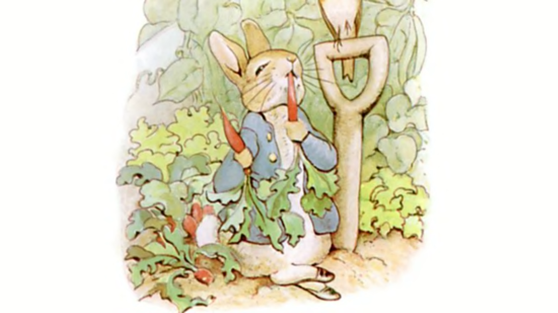
I think the most successful one is Illustration 1. This is because they have grasped the atmosphere and fear factor of how we as humans preserve bugs. This is mainly what the story is about - How humans react to grotesque things. I like the fact they have used the beetles shadow to show the fear. This is how as children we think of imaginative scary monsters under the bed and they have incorporated that same fear with the beetle which works very well.
They are tiny creatures yet are one of the top things that create fear in humans, just by their appearance. Personally, like most people I am squeamish of insects. If one lands on me or I see a spider I feel itchy and scared. I don't kill them though I end up getting my partner to capture them and take it outside. I fear that if I don't get rid of it, an hour later or so when i'm relaxing on my sofa I will capture a glimpse of it crawling on me and I will be screaming. So for that reason any bug has to go if it is in my house., Its quite funny really of how scared most of us get when we see a bug - Most are actually harmless. I've tried to tell myself this - But I just cannot help fearing them!
Research point
Look at a range of book or magazine covers that use illustration. How does the typography of the title, author and other details interplay with the illustration? What’s the relationship between type and image? Identify examples where the illustrator has created space in their image to accommodate the typography, and other examples where this relationship is less successful. Can you find examples where the type and image are pulling in the same direction – where they’ve supported each other successfully? Pick a range of examples and discuss how the relationship between image and text works. Use your learning log to record your thoughts. You may want to photocopy or scan your examples and annotate them. (If you’ve done OCA Book Design 1, then you’ll have already done something similar, but it’s still worth examining again, paying attention to the relationship between illustration and typography.)
I have researched by looking at books, magazines and images online. I created a mini scrapbook which you can see glued in my sketch book. Below are my favourite images which I thought were interesting and stood out:
Here is my Pinterest link where you will find the source of all these images: https://www.pinterest.co.uk/paperpawtraits/image-and-text/

Here is my Pinterest link where you will find the source of all these images: https://www.pinterest.co.uk/paperpawtraits/image-and-text/
The title to this magazine blends in with the green foliage at the top. I don't think it makes the title very clear to read as the font is a blue/green colour. It blends in as though as its trying to be camouflaged and the illustration becomes the focal point.
As a viewer you are drawn to look at the illustration of a room. There is a barcode bottom right of the magazine. The title is all lower case which creates a child like atmosphere. Looking at the room in the illustration, it looks messy which tells me that its a young adult that lives there. There is a fridge and other parts of furniture all put in to one room which reminds me of a student living area. This also is a tell telling sign that they are wanting to attract young adults such as students who can relate to the illustration. The relationship between type and image is that they both give an expression of being young. They are bright and create a happy feeling to the viewer.
The illustrator created space at the top of the illustration in the bush plane area for the title. Personally, I would of made the title an orange or yellow to compliment the blues within the illustration and make it stand out but perhaps after looking at it more closer that they wanted to blend in the title to express the mess in the room. Finally the title in the bush makes it feel heavy which makes the viewer look below it, this is an area where the illustration and the title are flowing in the same direction.

I really liked this cheeky magazine cover. The title and other details are fitted carefully around the illustration. The child swimming in the illustration has a circle head which relates to the magazine title dot. Its quite clever how they have done it so the illustration and title work together, The title is again like the one above in lower case and the illustration is naive which tells me it is for a young age group. The title also blends in with the waves which also go through the font but of a different shade of blue to make it stand out. The illustrator has kept their design simple with basic shapes yet with the bold bright colours is a very good way to attract attention as it is easy on the eye to look at and understand.

I really like this illustration the line art the illustrator has created is very clever and draws the viewer to the moon in the centre - This is very smart as the title of the book has been purposely put on the moon as it is where the viewer is directed to. To enhance this further there is a hand rising up out of what looks like water. This is then pointing upwards below the moon again making the viewer look at the moon . Everywhere else in the illustration is full of wonderful swirly line markings so it makes the best place to put the title. In the sea area they have put the author's name. It has not got a white background like the title but is has been added well with a white fill in each letter to highlight it and make it easy to ready on a dark mark making area.

The illustrator of this book cover has actually turned the title in to an illustration - The illustration is a metaphor to the title. In the title it talks about weight and so the illustrator has thought about it and used their creativity to create a good idea of the meaning of weight through the title. They have put each word on top of each other and in certain areas created a dip to make it look as though the words are heavy and have weight to them. This relates the viewer to the meaning behind the title. This is a great example of illustration and title working well together as they are one.

This book cover for the man in the woods story captures you instantly. The illustrator has illustrated a forest an used the shapes and the placement of the branches to form a space in the shape of a man. It is quite mysterious and makes you feel intrigued about the story. Within that space they have put the title in a yellow tone which stands out on top on the green background. The font of the title is designed to look wooden to go with the illustration. They have also made room underneath for the authors name which is in joined up writing. By combining the title and the illustration the viewer understands what the book is about. It is a great example of image and text working together to portray the books subject.

I thought this illustration was well thought out and I like the style. It is another example of image and text working well together to give the viewer an idea of what the book is about. The title says Light Jar and the illustration is of a jar - within the jar sits the title which is designed to look like the light that glows inside the jar. There is also a man and a wooden cabin which has a light coming out of the top window (it is shown as a focal point in the illustration - prob significant to the story) below the Jar, space has been made for the author and above the jar there is a subtitle which gives the viewer a insight in to the story. The illustration is engaging and make you want to discover the story of the things that you can see in the jar,

A classic tale and I think the illustrator has done a good job at capturing what the story is about. The illustrator has used blue and orange tones which compliment each other making it an attractive book cover to look at. The illustrator has used the rule of third in the composition with the mermaid slightly to the left with her hair moving around in the water, The title has been put in the space of her hair, which is nearly centre to the illustration. The mermaid is tilted looking at the title, which draws the viewer to it. Event the reef plants are making you look at the title based on the direction they are going. At the bottom is the author's name and there is some plants pointing towards that. It is a classic tale so I feel the publisher wanted the illustration to show what it is as the title is quite small on the cover. The title more of a conformation to the viewer that it is that classing well known tale of the little mermaid.

Think this has to be my favourite book cover out of all I have looked at - Its simple yet very effective.The illustrator has drawn a wolf top right corner and used his left side of its body to make the fur from its body and tail to create a silhouette of the boy in the story. Also in that space of the boys head they have put the title. The wolf's body and tail wraps around the title making you focus on that area. The background is white which is snow with bit of leaves and a bird. It is probably of some importance in the book. The titles font is kept simple and is the colour of red which really stands out on the white background. I think the colour also represents blood, as the story Is about a wolf which are dangerous predators. The image and text work well together and I really love the creative aspect what the illustrator has come up with.
My overview
By looking at these book covers I understand how important it is to be also thinking about text and space in am illustration. Depending on the brief given and where a publisher requires the title and other information, is key to creating the right book or magazine illustration. Some illustrators are also asked to incorporate the title in the illustration, so the illustrator gets to design the font style to match and fit in their illustration. Also the illustration generally needs to be clever to show the subject of the book, with out giving too much of the story away. A lot of illustrators tend to use there illustration to direct the viewer to the title of the book. This research has shown me there are key things to think about before you start a book cover illustration and to make sure you understand what the publisher wants.
Research point
There are plenty of examples of illustrators who have defined a story visually by being the first or best illustrator to respond to it, such as Winnie The Pooh (1926) written by A A Milne and illustrated by E H Shepard, The Gruffalo (1999) written by Julia Donaldson and illustrated by Axel Scheffler, or Little Red Riding Hood (1812) as defined by the Brothers Grimm and illustrated by Arthur Rackham. Look at some of these examples or find your own. What is it about the illustrations that links so well with the text? Is it simply familiarity, that we’ve got used to seeing these characters in this way, or is there more going on in the relationship between image and text? Pick a few visual examples to discuss in your learning log.
Peter Rabbit
Peter Rabbit is a classic story which is famous not only for the story but the wonderful illustrations too. Its been more than 100 years since he first appeared on the page, he continues to be one of children’s literature’s most popular and enduring characters. Beatrix Potter not only wrote the story but she also did her own illustrations to which are charming, cheeky and have a unique style through watercolour.
What is it about the illustrations that links so well with the text?
I remember having a Peter rabbit book when I was young - I enjoyed the story as he was a naughty rabbit but it was the illustrations which made me fall in love with Peter Rabbit. The story and illustrations worked well together. The Story gave the little bunny on the page that I was looking at his personality and the illustrations were great at giving you a visual storytelling which was easy on the eye. Peter Rabbit is such a charming character he is so very curious and always tries to find a way to do something he wants to do just like a child - In this sense I could relate to him. Even if there is a certain Ewan Mcgregor around trying to catch him, It was exciting and showed bravery and persistence to follow a dream.
Is it simply familiarity, that we’ve got used to seeing these characters in this way, or is there more going on in the relationship between image and text?
Peter Rabbit had been around for years and because of this is has helped build bridges between generations. Peter Rabbit is a book that you just fall in love with so much as a child you also want to pass it on to your children too once an adult. It is a magical book and it has familiarity to it as a child. As Beatrix illustrated her own illustrations no one else has been able to recreate her story with their own illustrations - Its just not the same. It is a classic where we have gotten so used to seeing the characters how she portrayed - And I don't think anyone else could do them any better. There is something special about an author illustrating her own stories - It portrays just what she had imagined Peter Rabbit would look like and you can see her heart and soul within both her Writing and illustrations - I think that is what makes it so special. I wonder how she would feel if she could see how big Peter Rabbit is now and how much joy it brings to so many children and adults around the world!
The Snowman
Raymond Briggs is the creator of the story The Snowman and also the illustrator. The Snowman is a wonderful enchanted story for Christmas time. It is about a snowman who comes alive and takes his creator on a journey which any child would love. He flies over the sky and also gets to meet father Christmas. It is beautifully illustrated using coloured pencils and watercolour in some areas. The mediums help the snowman look delicate and yet creates a fantastic scene of winter. It is a very popular story and I am sure every child in the UK especially knows of it.
What is it about the illustrations that links so well with the text? And Is it simply familiarity, that we’ve got used to seeing these characters in this way, or is there more going on in the relationship between image and text?
In the book it is actually quite special as there is no written story - The viewer only has the illustrations to look at to understand it. I don't know many stories like this where there are no words at all. The Snowman is also an animation and again there is not words, speech or narrative. Instead there is classical music which portrays the story, from fast sounds whilst flying to gentle notes to create an atmosphere of it lightly snowing. It is somewhat a masterpiece in itself that is so popular today. Again like Peter Rabbit it is a classic which generations love to share with their young ones. As this exercise asks me to explain how the text links with the illustrations this is a hard one to answer. But I wanted to make a point of it to show that you can portray a story without words in a book. We have gotten so use to seeing these characters just like Peter Rabbit that there is no need for anyone to bring out their own style - When people think of the Snowman they think of the illustrations that are brought to life in an animation. Its a feel good story that really gets you into the spirit of Christmas.
The BFG

What is it about the illustrations that links so well with the text? And Is it simply familiarity, that we’ve got used to seeing these characters in this way, or is there more going on in the relationship between image and text?
The Relationship between author Roald Dahl and illustrator Quentin Blake began with The BFG to go on to work together on to produce many children s books. I found this wonderful article about how they would work together.
Which makes sense to me in order to create the illustrations you must understand the story and the written aspect to it to work along side it in harmony. This is why the images and text in The BFG work so well together. Quentin has really understood the story and Roald Dahls imagination to create illustrations that simply flow with the story.
Quintons style also helps to portray the story to children. He is very loose with his line making - To some what like a child's scribble compared to many other illustrators. He is very different and that is what makes his illustrations pleasing to look at. I think it is the relationship between author and illustrator which creates a good book. The images on each page goes with the text written and has made sure all the key information is within the illustration to help the children use their own and understand the characters in the story.
Image and text opinion
From my research and my own experience as a child reading books, I do think that images and text need to work in harmony together. There are a lot of different types of books and ways that illustrators and authors do this, either by using text in their images (example 1 below), creating the text in a way for your eyes to follow to each illustration (like below example 2) or have a paragraph (example 3 below) . The illustrator draws out the key elements to help the reader visualise and learn about the characters and story.
Example 1: Words within a illustration example:

Ive noticed that this is usually used when there is shouting or a noise which the author, illustrator and publisher agree to be exaggerated to emphasise on that part of the story. Children love playful and noisy words and it makes it fun to read

Example 2 to show words put on a page in a way to make the viewer follow the flow to an illustration
Notice how the words are not in a straight line they are in a flowing motion to help direct the viewer to the illustrations as well as creating an atmosphere. Another good example of this would be if a story was about a pirate boat in a storm the wave motion of the font would also create the atmosphere of being at sea.
Notice how the words are not in a straight line they are in a flowing motion to help direct the viewer to the illustrations as well as creating an atmosphere. Another good example of this would be if a story was about a pirate boat in a storm the wave motion of the font would also create the atmosphere of being at sea.
Example 3 Standard text and image.

Usually a paragraph and the illustrator puts the key elements of that part of the story in to an illustration beside it.
Usually a paragraph and the illustrator puts the key elements of that part of the story in to an illustration beside it.
Some Characters such as Peter Rabbit become famous because of the illustrators style and the personality he acquires from the written story. If you have a good author with a good illustrator (or even better the same person who does both!) The the story I feel becomes real and people can relate. The three above I have mentioned all made an impact on me when I was younger because they were about adventure, dreams, being a hero - everything as a child you aspire to be. They help you to grow as a person, learning life lessons (in a fun way) and also they become your friends, you simply fall in love with them and they really do stick with you as you grow older.
Exercise: Once upon a time
- Your illustrations will sit alongside the text to enhance the reading experience.
- Think about the best point(s) in the narrative to place your illustrations.
- Your illustrations need to bring the characters, locations and plot of the story to life. But you don’t have to do all of this in one illustration, so think about introducing different aspects across a range of illustrations. Make the most of the dramatic qualities of black and white.
- Think about where you’d physically place your images in relationship to the text on the page.
- Are these illustrations full page or vignettes?
- Do you incorporate some of the story’s text into your work or do they stand alone as images?
Thoughts and research
For this task I have to produce several black and white illustrations alongside text to show my understanding of relationships between text and illustrations and also when creating illustrations to consider were the text is going to be on the page. Whether that means around the illustrations or within the illustrations.
From my research previous this exercise I have looked at how illustrators use text within there work and what information is needed on a cover of a magazine or book. I am now going to do some research inside children's books to see how illustrators work with the content of a book. As this task is about once upon a time stories I feel that looking at children's books will help me with this exercise best.
I have picked out three books from my bookshelf, to discuss and research more about space on a page.


When something dramatic is happening there is one big illustration covering both pages to show an important part in the story. Nothing is boxed up, the wording is usually in the white space areas on the pages to make the writing clear, whereas some areas in the book have the writing on the illustrations coloured background to make the reader more immersive and feel like they are in the story subconsciously.
Some areas of the book has a lot of wording about 3 to 4 paragraphs at a time on one page. I have noticed in this book that this is usually the case before an important part in the story giving the reader information and a build up before the reveal.

However the format of the book changes in the last few pages where the illustrations are now telling the story and there is a lot less wording. Here above you can see the font changing as the elephant is spinning the crocodile the words ‘and faster’ get bigger and bigger as the elephant swings the crocodile around faster in the illustrations. It creates a dramatic effect and a play on the illustrations. it enhances your understanding of both the wording and the illustrations making a great balance between the two.
It is also interesting to see how Quentin Blake captured the movement of the elephant swinging the crocodile particularly in this illustration above, where he has drawn the crocodile a lot of times under the elephant side by side in and an arch shape construction which gives an illusion to the viewer of movement.

Another thing to point out is the layout of the book where the publisher information is and sometimes a dedication of the book message - In this book the info is on the second page on the left and the story starts on the right side age - this is uncommon and usually the publisher info etc is on its own separate page but I do get why, the story covers a lot of pages and a standard children's book is 32 pages so they have looked at is and decided to put it in this way to free up some space.

Overall in this book you can clearly see where the dramatic parts of the book are based on the layout and the composition of the book. When you turn a page your either reading a buildup to an important part of the story (which has lots of word content) or a page where there is less words and bigger illustrations, where the illustrations do the talking - This is my opinion which shows a good balance between words and illustration. It is an enjoyable easy going book to ready and lots of information so you build up an opinion of the characters and each page turn over is different from the next. This is exactly what children are looking for something that is exciting and where they can use their imagination.


In this book there is way less wording than in the Enormous Crocodile story book. Instead the amount of wording is the same proportion of illustrations. The is an illustration for ever one or two sentences through the book A god example is the sentence ‘the Wombat ate a carrot’ with an illustration underneath of the wombat eating a carrot.
There is hardly any backgrounds. The illustrations and the wording are both placed on a white blank page.The illustrations are cute and detailed. The book is about a Wombats day to day life.and what he gets up to. Its a very simple book so I would suggest it was for younger children then who would read the Enormous Crocodile Book. The balance in the book between content and illustrations is balanced but I found a lot of the time the illustrations duplicate the wording - This is because the illustrator only had a sentence to work with for each illustration, so I understand the reasoning of it. Im my opinion the book really didn't need any content wording as the pictures do tell the story. Wording may come in useful though for the dates on each page however that could of been illustrated too.

At the end of the book however there is a page, the only page in the book where it has a paragraph rather than a simple sentence or two This part of the story is where the Wombat talks to himself and is deciding if he likes the humans or not. Its an important part which then on the last few pages sees the wombat finally deciding he likes them, wants to live near them and the benefits he gets
The font style used throughout the book is clever and compliments the story. The font is in a playful style which reminds me of the outback in Australia, which is where Wombats come from. Compared to the Enormous Crocodile book where a basic font is used. It is often turned into an italic format when the crocodile is singing. The font in the Wombat book goes with the theme overall and makes the story immersible to read. The font reflects the atmosphere and personality created from the wording and illustrations.


It unusual that in this book the first page of the story starts on the left page unlike regular books which usually start on the right-hand page Even though 32 pages is standard in a children's book this story is shorter and takes up 28 pages. Then 4 other pages have been made up to get the amount to 32. They have been filled up with the publishers info, the heading on the book and a simple illustration on the back page of the Wombat. These altogether makes 32 pages, which then becomes a standard book - I guess for the printing of the book 32 pages work out better as its a standard rather then a book that has 30 pages which may cost more as its then a custom made.


This is one of my favourite modern children's books it is so much fun and very colourful. The wording is bigger in this book compared to the other two books I have looked at. There is short paragraphs which is more that the Wombat book and less than the Enormous Crocodile book. There is a good balance of wording and illustrations to tell the story. The illustrations are not duplicating the wording but taking the key aspects from it to create a visual idea.
Again like the Enormous Crocodile book the wording is in white spaces and sometimes placed on top of a coloured background in an illustration. This helps the viewer feel they are in the story and sometimes looking at it from a narrative view.
The Enormous Crocodile by Roald Dahl and Quentin Blake
Number of Pages 32


A lot of time in this book I see the left page has a lot of wording with illustrations around it compared to the right side pages where the illustrations are in boxed line borders and the text is either below or above each box to help have a balance of visualisation and understanding. 


When something dramatic is happening there is one big illustration covering both pages to show an important part in the story. Nothing is boxed up, the wording is usually in the white space areas on the pages to make the writing clear, whereas some areas in the book have the writing on the illustrations coloured background to make the reader more immersive and feel like they are in the story subconsciously.
Some areas of the book has a lot of wording about 3 to 4 paragraphs at a time on one page. I have noticed in this book that this is usually the case before an important part in the story giving the reader information and a build up before the reveal.

However the format of the book changes in the last few pages where the illustrations are now telling the story and there is a lot less wording. Here above you can see the font changing as the elephant is spinning the crocodile the words ‘and faster’ get bigger and bigger as the elephant swings the crocodile around faster in the illustrations. It creates a dramatic effect and a play on the illustrations. it enhances your understanding of both the wording and the illustrations making a great balance between the two.
It is also interesting to see how Quentin Blake captured the movement of the elephant swinging the crocodile particularly in this illustration above, where he has drawn the crocodile a lot of times under the elephant side by side in and an arch shape construction which gives an illusion to the viewer of movement.

Another thing to point out is the layout of the book where the publisher information is and sometimes a dedication of the book message - In this book the info is on the second page on the left and the story starts on the right side age - this is uncommon and usually the publisher info etc is on its own separate page but I do get why, the story covers a lot of pages and a standard children's book is 32 pages so they have looked at is and decided to put it in this way to free up some space.

Overall in this book you can clearly see where the dramatic parts of the book are based on the layout and the composition of the book. When you turn a page your either reading a buildup to an important part of the story (which has lots of word content) or a page where there is less words and bigger illustrations, where the illustrations do the talking - This is my opinion which shows a good balance between words and illustration. It is an enjoyable easy going book to ready and lots of information so you build up an opinion of the characters and each page turn over is different from the next. This is exactly what children are looking for something that is exciting and where they can use their imagination.
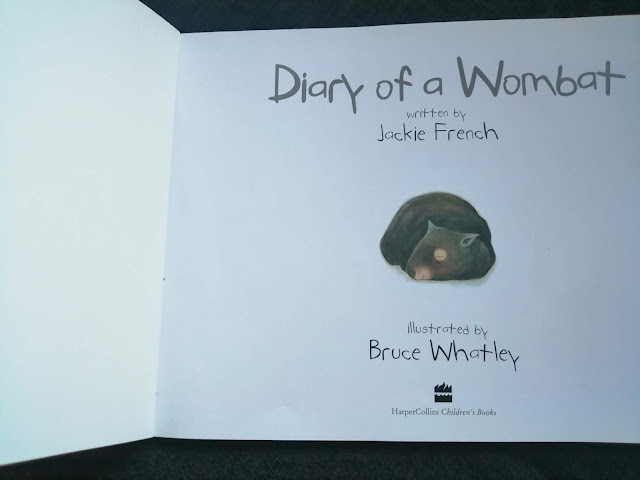
Diary Of A Wombat by Jackie French and Bruce Whatley
Number of pages 32


In this book there is way less wording than in the Enormous Crocodile story book. Instead the amount of wording is the same proportion of illustrations. The is an illustration for ever one or two sentences through the book A god example is the sentence ‘the Wombat ate a carrot’ with an illustration underneath of the wombat eating a carrot.
There is hardly any backgrounds. The illustrations and the wording are both placed on a white blank page.The illustrations are cute and detailed. The book is about a Wombats day to day life.and what he gets up to. Its a very simple book so I would suggest it was for younger children then who would read the Enormous Crocodile Book. The balance in the book between content and illustrations is balanced but I found a lot of the time the illustrations duplicate the wording - This is because the illustrator only had a sentence to work with for each illustration, so I understand the reasoning of it. Im my opinion the book really didn't need any content wording as the pictures do tell the story. Wording may come in useful though for the dates on each page however that could of been illustrated too.

At the end of the book however there is a page, the only page in the book where it has a paragraph rather than a simple sentence or two This part of the story is where the Wombat talks to himself and is deciding if he likes the humans or not. Its an important part which then on the last few pages sees the wombat finally deciding he likes them, wants to live near them and the benefits he gets
The font style used throughout the book is clever and compliments the story. The font is in a playful style which reminds me of the outback in Australia, which is where Wombats come from. Compared to the Enormous Crocodile book where a basic font is used. It is often turned into an italic format when the crocodile is singing. The font in the Wombat book goes with the theme overall and makes the story immersible to read. The font reflects the atmosphere and personality created from the wording and illustrations.


It unusual that in this book the first page of the story starts on the left page unlike regular books which usually start on the right-hand page Even though 32 pages is standard in a children's book this story is shorter and takes up 28 pages. Then 4 other pages have been made up to get the amount to 32. They have been filled up with the publishers info, the heading on the book and a simple illustration on the back page of the Wombat. These altogether makes 32 pages, which then becomes a standard book - I guess for the printing of the book 32 pages work out better as its a standard rather then a book that has 30 pages which may cost more as its then a custom made.
The Highway Rat by Julia Donaldson and Axel Scheffler
Number of pages 32


Again like the Enormous Crocodile book the wording is in white spaces and sometimes placed on top of a coloured background in an illustration. This helps the viewer feel they are in the story and sometimes looking at it from a narrative view.


The page format is about the same as the Enormous crocodile book such as every time something dramatic happens the illustration then covers both pages and when there is a buildup it has smaller one or two illustrations on a page.


Interestingly on page 21 the illustration takes a twist and includes the actual wording in the illustration. It is a main part of the story where a duck is shouting into a cave to fool the highway rat. The illustration is looking into the mouth of the cave.. The wording is placed on this dark area to give the illusion of the ducks voice echoing and coming back out of the cave. The font has movement and is playful. The words are arched into a swaying motion, which reflects the wave of the sound coming back out. The font also gets smaller to show the returning echo getting fainter and fainter. It's a very clever effect and play on words to merge them in the illustration and make this part of the story interesting keeping the viewer alert for what is about to happen next. Through the illustration it shows that this is an important part of the plot. On page 22 this also continues to show echoes coming through the cave.

This part is the most dramatic part in the book when the animals get revenge on the Highway Rat and celebrate with a huge party in the woods. The next few pages at the end sees the Highway Rat come out the other side of the cave and start a new life as a nicer person and with a proper job instead of robbing riches. There is a great message in the book to educate children about doing wrong things such as robbing and showing that there is always a chance to change if you take the wrong path to become a better person.


Compared to the dedication and publisher pages in the other two books, this area in this book is actually on the last inner page. And again the story begins on the right hand side with the fist illustration covering ¾ of the double page,
Lately I have been reading a Bloomsbury Book called ‘Illustrating Children's Books’ it has been a great book full of useful information to help with this task and also help me to understand what it takes to become a children's illustrator. .
Relationship between words and pictures is a unique and sometimes complex one. The roles of each need to be considered being balanced and complementing rather than duplicating each others statements.
Words and images are so closely connected in a children's picture book that increasingly the author and illustrator are the same person, which I feel is great as you can then make sure the illustrations and images fit in just how you would like it in the finished book.
Most of the time words and illustrations speak simultaneously so when creating a picture book they need to be constantly shifted and rearranged to find the balance between each other
Black and white illustrations are not so popular today due to modern students working through colour. However there is still a high demand in black and white illustrations for older children but this is pure line work. Working purely on black and white requires some forward thinking because of understanding values in an illustration, especially if you are creating an illusion through tone and mark makings. Top ways to create black and white illustrations are by using pens, ink and brush or digitally. To capture tone in black and white illustrations cross-hatching is very helpful which creates the illusion of different tones in the illustrations.
Each book is formatted differently which is quite exciting as it means its flexible and you can create your own ideas. There are things similar in which a story is told with dynamic moments, build up moments and parts where there is a lot of information to give the reader some background which helps relate to characters and feel familiar with them. This is also shown how the illustrations are inputted in the book too for example a 2 page illustration is created for an important part of the story to get visualisation of what's happening at that part of the story. The amount of words in each children's book differs too and the font style all to go with the personality of the book and story line.
32 pages is a standard children's book but I reckon if its shorter its then not a standard so it costs more to make that is why sometimes the publication info and an extra illustrations are added to extend the book.
By doing this research I have learnt a lot about children's books and how the written story and the illustrations in a book have to balance. They both have to work together to tell the story clearly for children to read and use their imagination based on the information in front of them. The illustrations need to pick out important parts of paragraphs and small sentences to tell the story and give a visual idea. Things such as style , size of font and including wording in to an illustration create personality in a book and makes it playful for children. At the same time being clear and easy to read and follow.
I think any good children's book needs to follow these basic rules and structure to become successful. There needs to be a format or pattern to the book so it becomes familiar and comfortable even when it goes unnoticed by children. Subconsciously to a reader a book should have a balanced order to the book that flows in harmony from page to page.
First of all I need to think of what story I would like to do. I need to think about how many illustrations I need and also my style that I want to use. I am going to do some mind mapping to list some of my initial ideas and pick one that I think is suitable for the task
Once upon a time books especially for children have a hidden messages about learning to grow up and important life lessons which will help them as they get older.

Here above is my page of mind mapping I have done. I narrowed it down two three stories - Little Red Riding Hood, Jack and the Beanstalk and The Ugly Duckling, all of which made an impact on me when I was a child.

This part is the most dramatic part in the book when the animals get revenge on the Highway Rat and celebrate with a huge party in the woods. The next few pages at the end sees the Highway Rat come out the other side of the cave and start a new life as a nicer person and with a proper job instead of robbing riches. There is a great message in the book to educate children about doing wrong things such as robbing and showing that there is always a chance to change if you take the wrong path to become a better person.


Compared to the dedication and publisher pages in the other two books, this area in this book is actually on the last inner page. And again the story begins on the right hand side with the fist illustration covering ¾ of the double page,
Further research
Lately I have been reading a Bloomsbury Book called ‘Illustrating Children's Books’ it has been a great book full of useful information to help with this task and also help me to understand what it takes to become a children's illustrator. .
Relationship between words and pictures is a unique and sometimes complex one. The roles of each need to be considered being balanced and complementing rather than duplicating each others statements.
Words and images are so closely connected in a children's picture book that increasingly the author and illustrator are the same person, which I feel is great as you can then make sure the illustrations and images fit in just how you would like it in the finished book.
Most of the time words and illustrations speak simultaneously so when creating a picture book they need to be constantly shifted and rearranged to find the balance between each other
Black And White Work
Black and white illustrations are not so popular today due to modern students working through colour. However there is still a high demand in black and white illustrations for older children but this is pure line work. Working purely on black and white requires some forward thinking because of understanding values in an illustration, especially if you are creating an illusion through tone and mark makings. Top ways to create black and white illustrations are by using pens, ink and brush or digitally. To capture tone in black and white illustrations cross-hatching is very helpful which creates the illusion of different tones in the illustrations.
Overall
Each book is formatted differently which is quite exciting as it means its flexible and you can create your own ideas. There are things similar in which a story is told with dynamic moments, build up moments and parts where there is a lot of information to give the reader some background which helps relate to characters and feel familiar with them. This is also shown how the illustrations are inputted in the book too for example a 2 page illustration is created for an important part of the story to get visualisation of what's happening at that part of the story. The amount of words in each children's book differs too and the font style all to go with the personality of the book and story line.
32 pages is a standard children's book but I reckon if its shorter its then not a standard so it costs more to make that is why sometimes the publication info and an extra illustrations are added to extend the book.
By doing this research I have learnt a lot about children's books and how the written story and the illustrations in a book have to balance. They both have to work together to tell the story clearly for children to read and use their imagination based on the information in front of them. The illustrations need to pick out important parts of paragraphs and small sentences to tell the story and give a visual idea. Things such as style , size of font and including wording in to an illustration create personality in a book and makes it playful for children. At the same time being clear and easy to read and follow.
I think any good children's book needs to follow these basic rules and structure to become successful. There needs to be a format or pattern to the book so it becomes familiar and comfortable even when it goes unnoticed by children. Subconsciously to a reader a book should have a balanced order to the book that flows in harmony from page to page.
The task at hand
First of all I need to think of what story I would like to do. I need to think about how many illustrations I need and also my style that I want to use. I am going to do some mind mapping to list some of my initial ideas and pick one that I think is suitable for the task
Once upon a time books especially for children have a hidden messages about learning to grow up and important life lessons which will help them as they get older.

Here above is my page of mind mapping I have done. I narrowed it down two three stories - Little Red Riding Hood, Jack and the Beanstalk and The Ugly Duckling, all of which made an impact on me when I was a child.
I then looked at each story (found versions on the internet) and worked out how many illustrations I would need to tell it and how much writing is involved. I need some thing which is manageable.
Red riding hood - Average amount of word content and about 14 illustrations
Jack and the Beanstalk - A lot of wording and over 16 illustrations - too much work
The Ugly Duckling - small amount of wording and 8 illustrations. - perfect for this exercise!
Based on my research on the three stories I have decided to go with the ugly duckling book as it will be more manageable then the other two.
Based on the illustrations of the book I want to give my self a challenge so I have decided to create my illustrations by using the pop up method. This way I will be using my favourite medium along side with line work in a black and white format. I have always been interested in making pop ups and this task is a great opportunity to get started and experiment which I am looking forward too.
I have found a few versions of the ugly duckling story online:
https://www.youtube.com/watch?v=TyrmcD8Yml0
https://www.dltk-teach.com/fairy-tales/ugly-duckling/story.htm
https://www.storiestogrowby.org/story/the-ugly-duckling-story-a-fairy-tale-story-for-kids/
I have looked at them all and decided I want to create my own version. I am still going to go with the same plot and what the Ugly duckling is based on but in my own way. Here below I have written my version of the story. It has taken me a while to get the story right and one that I am happy with. In between the wording I have broken it up and shown where to include an illustration and what this illustration is about. I have read each paragraph and picked out what is most important to create illustrations from.
momma duck with eggs
Young children love to play and interact with books. I for one as a small child remember having so much fun with pop up stories. As this is a challenge for each illustration i need to be well planned to work out the paper engineering technique sand how each illustration is going to work. A paper engineer tends to be the main illustrator of a book or usually a special
ist who will work with a range of artists to help them realise their particular three dimensional vision.
Red riding hood - Average amount of word content and about 14 illustrations
Jack and the Beanstalk - A lot of wording and over 16 illustrations - too much work
The Ugly Duckling - small amount of wording and 8 illustrations. - perfect for this exercise!
Based on my research on the three stories I have decided to go with the ugly duckling book as it will be more manageable then the other two.
Based on the illustrations of the book I want to give my self a challenge so I have decided to create my illustrations by using the pop up method. This way I will be using my favourite medium along side with line work in a black and white format. I have always been interested in making pop ups and this task is a great opportunity to get started and experiment which I am looking forward too.
The story content - The Ugly Duckling
I have found a few versions of the ugly duckling story online:
https://www.youtube.com/watch?v=TyrmcD8Yml0
https://www.dltk-teach.com/fairy-tales/ugly-duckling/story.htm
https://www.storiestogrowby.org/story/the-ugly-duckling-story-a-fairy-tale-story-for-kids/
I have looked at them all and decided I want to create my own version. I am still going to go with the same plot and what the Ugly duckling is based on but in my own way. Here below I have written my version of the story. It has taken me a while to get the story right and one that I am happy with. In between the wording I have broken it up and shown where to include an illustration and what this illustration is about. I have read each paragraph and picked out what is most important to create illustrations from.
The Ugly Duckling - By Gemma Lees
Cover of Book
Once upon a time there was a momma duck looking after a nest of eggs by the side of a river. There
were three eggs two small and one very large odd looking egg.
were three eggs two small and one very large odd looking egg.
One day the eggs began to hatch, there were two normal ducklings and one unusual looking ugly
duckling, The other two young ones made fun of him. The ugly duckling felt hurt and decided to swim
away.
duckling, The other two young ones made fun of him. The ugly duckling felt hurt and decided to swim
away.
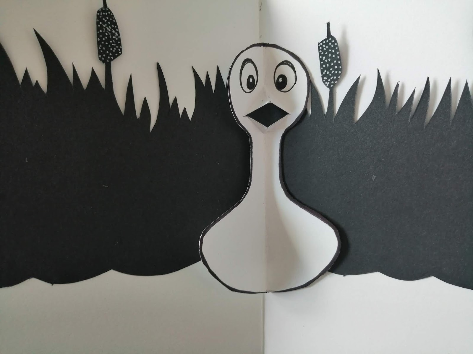
Eggs Hatching and looking at ugly duckling
The ugly duckling swam up the river. He came across a frog sitting on a lily pad. The frog looked at him
and said “Ribbit! your just as ugly as me!” before diving into the water. The ugly duckling felt hurt again
and that even a frog didn't want to be his friend.
and said “Ribbit! your just as ugly as me!” before diving into the water. The ugly duckling felt hurt again
and that even a frog didn't want to be his friend.
Ugly Duckling with toad Ribbit Ribbit!
The ugly duckling continued to swim along. He came across a huge cow drinking from the river. The
cow opened her eyes and said ‘Mooooo! you are so ugly you gave me a fright!’ The cow turned around
and went to graze in the field. The ugly duckling began to cry as he felt like he had no friends and
everyone thought he was ugly.
cow opened her eyes and said ‘Mooooo! you are so ugly you gave me a fright!’ The cow turned around
and went to graze in the field. The ugly duckling began to cry as he felt like he had no friends and
everyone thought he was ugly.
Ugly duckling with cow Mooooo!
The ugly duckling could not take much more and decided to hide under a bush by the side of the
river, he started to cry. He thought to himself that he wished he had a friend. He was hungry and tired
and after a while he fell asleep, A kind farmer walked by and heard snoring from under the bush.
river, he started to cry. He thought to himself that he wished he had a friend. He was hungry and tired
and after a while he fell asleep, A kind farmer walked by and heard snoring from under the bush.
Ugly duckling under bush in rain with farmer spotting him
The farmer saw the poor ugly duckling and said ‘Here let me help you’ The farmer took the duckling to a
barn and wrapped the duckling up in a towel and said ‘I'll release you back to the river in a few months
when your much stronger.’
barn and wrapped the duckling up in a towel and said ‘I'll release you back to the river in a few months
when your much stronger.’
Ugly Duckling with farmer in barn
A month later the farmer tells the ugly duckling ‘I think you my friend are ready to go back to the river’.
The ugly duckling was very grateful for the farmers care and did feel a lot stronger. The farmer
released him on to the river. The Farmer said’ Goodbye, you will be just fine here’ and off he went
The Ugly Duckling looked around and saw two white beautiful birds in front of him.
The ugly duckling was very grateful for the farmers care and did feel a lot stronger. The farmer
released him on to the river. The Farmer said’ Goodbye, you will be just fine here’ and off he went
The Ugly Duckling looked around and saw two white beautiful birds in front of him.
Lake with two swans
The beautiful birds in the lake looked at the ugly duckling and said ‘hey are you new? Come and
join us.' The ugly duckling was afraid and didn't understand, he held his head down, ready to be
teased of his ugliness and at that moment caught a glimpse of his reflection in the river. He was no
longer an ugly duckling, but a beautiful bird, just like the ones in front of him - He had Turned into a
magnificent Swan.
Seeing himself in his reflection
The now magnificent swan spent all day together getting to know the other two swans. On the
evening they all flew up high and watched the stars together to celebrate their new friendship.
evening they all flew up high and watched the stars together to celebrate their new friendship.
The End
Ending with three swans together
Back of book
Total of 9 illustrations Black and white. plus cover.
After writing out the story I realised there is actually 10 illustrations to do including the cover of the book but this is still less than the other two that I looked at. I am happy with my story and the next step is to look at creating pop ups.
Pop Up Books
ist who will work with a range of artists to help them realise their particular three dimensional vision.
Here below are references I have looked at to get information and ideas for my pop up designs.
https://en.wikipedia.org/wiki/Pop-up_book


https://en.wikipedia.org/wiki/Pop-up_book
Now I have my story and looked at pop up engineering I feel I am now ready to create my illustrations. I'm really excited about creating the pop out style and bringing my illustrations to life every time you open a page.
Initial Character design and other sketches.


I started off doing some character designs to get use to my main character. And also practised drawing other things that will be in my illustrations along the way too. If this was a real book I was putting everything in to I would have spent way more time looking at the concepts of the characters in depth. However I love my little ugly duck I have created he looks so cute and sad which will go well with his personality. I have also sketch out some swans once he changes in to one. I have also had a go at the frog, cow and the farmer which I am happy with.
From my research I know that black and white is not so popular in younger children's books but as a pop up I am hoping it may create a more of a different effect and actually turn out to be a quirky modern way of seeing the story.
The Story Board


Again if I was to be doing this as a proper project rather an exercise I would have tested out each scene 30 times to make sure I have the best composition available. I have looked at each part of the story and arranged where I think the text will go and also tried to work out and show how my illustration will pop out.
I attempted the storyboard twice to make sure at this time I have found the best ways to include the text. Also on the dramatic paged I have done a vertical illustration to cover both pages. And when I am giving information I have gone landscape... I think this shows a good format/pattern throughout my illustrations.
The written work will fit in to the areas shown. that are mainly white backgrounds. The last page the text will be on a black background but I think I will keep the font on a white background in a box to keep it clear. I may come across some issues later of but I will let you know in regards to space -I have also got to choose my font but will decide on this once the illustrations have been done.
Backgrounds in the illustrations I have kept basic as only having to use black and white. There are really only 3 different types of backgrounds in my story, the river bed with the reeds, the farmers barn and then at the end the swans flying through the sky.
I have also taken a big risk. I know the exercise was to do black and white illustrations but I wanted my ugly duckling to stand out so I am going to make him grey. It is still a tone of black which I think will still go with the theme but I feel this will as more character and give my illustrations a but of a modern twist to help children enjoy the black and white theme of the book.
I have also taken a big risk. I know the exercise was to do black and white illustrations but I wanted my ugly duckling to stand out so I am going to make him grey. It is still a tone of black which I think will still go with the theme but I feel this will as more character and give my illustrations a but of a modern twist to help children enjoy the black and white theme of the book.
For paper engineering techniques, I have looked at some paper engineering techniques and Im very excited to test them out and bring my story and characters to life. I have done a few practice ones so I can work out how to cut the paper to get the right type of pop up. they are in my large sketch book.
Book Cover

Here above are my book cover illustration Ideas, I really had fun here and it was great to experiment where the title and other bits of information will be going. I also played with the illustrations to create some great ideas such as the silhouette of the swan and inside the egg off the ugly ducking. I think all my ideas showed what the story is about without giving too much away. My favourite one that I am going to use is the one on the left on the second row. Ir shows the ugly duckling looking up at his shadow on the reeds but this shadow is a silhouette of his future self, a swan. I thought it played out well and I showed a few people and the majority picked out this one which also was a good indication that I have made the right choice. The title will fit in the silhouette of the swan which creates a great composition and pleasing to the eye.
Making the illustrations
Since writing here I have now finished my illustrations and ended up putting it all together to create a real book. While creating my illustrations I took notes and photos which I am now going to discuss to show the process I followed and and some problems I came across.
Each illustration had the same process I would look at my draft on the story board and then work out which parts were going to be popping out and how they would be popping out. Once I had an a better understanding I then looked at which background I needed for the scene. A lot of the times it was the silhouette of the reeds


https://youtu.be/ihNJstmTE5Y
Each illustration had the same process I would look at my draft on the story board and then work out which parts were going to be popping out and how they would be popping out. Once I had an a better understanding I then looked at which background I needed for the scene. A lot of the times it was the silhouette of the reeds

I would draw them out on back paper then cut them out with a craft knife. I glued them on the page but not where the reeds were so that they came away from the page to give a slight stick out effect.
I would then look at the rest of the illustration and then cut in to the card with the glued in background to create the levels for the pop up objects in the pop up. I also created the items that were going on to these tabs to make sure there was enough room and when the page was folded in half that none of the things were sticking out to keep it a surprise for when you open a page.
Here is two videos below of me sticking some parts in so you can see the process:
https://youtu.be/ZJGgShat7b4


Above is the two first illustrations completed I was very happy with the the use of black and white only allows you to be creative with the scene to create atmosphere and personality. The second illustration with the eggs hatch I found the tabs for the pop out quite tricky as all the objects were so close together so I cut out a square tab and then with in that tab cut out another tab on top so it created more different layers and depth in my pop up.


Above creating the ugly duckling


These photos above shown the process I took to create the cow scene. With the cow head I looked on the internet for different ways to make a head pop out. I found out that you had to angle the edges and only glue these down (base ears of the cow) so that when the page opens the head pushed forward towards the viewer. Once I got the hang of it I understood and even got to make his nose stick out even more by gluing it on as a separate piece on to the face.


Each page started off as a puzzle that I needed to understand and solve. It ended up being so much fun and I really enjoyed creating the pop ups. Some issues I had were sometime The separate characters and items that I was sticking in to the book were not the right size and I had to do them again a few times to get them right . I especially had trouble with the farmer who I did too tall I had to shrink him down but finally got there and he now looks great.
Once the illustrations were in place I then looked at the wording. I tried a few font styles. some were too bold or not very clear. As this is a pop up book I though that writing has to be simple and clear because there is a lot going on in each page. I started from the first illustration looked at the space I had purposely left for the writing and then go through each page to work out the shape of the paragraphs to make it sit well on the page without looking squashed. I also manage to keep it all the same font size. To add a bit of fun ,where there was an animal such as the frog and the cow I wrote on the scene the noise of the animal eg Mooooo as children love to learn the noises which I though would be fun for them to join in with telling the story.

Binding book
Once finished the pages I then decided it would be great to bind the book together.
Here below is a video and some photos showing how I did it.
Video: https://youtu.be/zF4M02zelUE

I would get a piece of card fold it in half and glue this to the back of the left hand side of the outer side of the card that had the illustration on. I would also do the same for the opposite page.


Once each side was stuck down and dry, I would glue the next page on to it and then adding another piece of card in-between. I think the video shows this better then me explaining but I kept doing this process until it was complete and all the pages were stuck together.

Above - the inner introduction page
The next and final part was to make the cover of the book:


I used a piece of cardboard and with my craft knife gently made a lie on one site three times to make the cover fold easily.


I then covered the card with a paper layer to make the cover ready to put my illustration on and the information about the book on the back.
Here is the finished cover illustration which came out really well :

I used a white pen to add the title on and the small bit of information. I think I created an attractive cover which give a great idea what the book is about and I think children will want to pick it up. Maybe on the front I should of written that its a pop up as usually pop ups do usually advertise to show its not just an ordinary book. I will keep a note of that when I create another one.
Finished book
Here below is the finished book in photos and I did a video if it too.


were three eggs two small and one very large odd looking egg.

One day the eggs began to hatch, there were two normal ducklings and one unusual looking ugly
duckling, The other two young ones made fun of him. The ugly duckling felt hurt and decided to swim
away.
duckling, The other two young ones made fun of him. The ugly duckling felt hurt and decided to swim
away.


The ugly duckling swam up the river. He came across a frog sitting on a lily pad. The frog looked at him
and said “Ribbit! your just as ugly as me!” before diving into the water. The ugly duckling felt hurt again
and that even a frog didn't want to be his friend.


The ugly duckling continued to swim along. He came across a huge cow drinking from the river. The
cow opened her eyes and said ‘Mooooo! you are so ugly you gave me a fright!’ The cow turned around
and went to graze in the field. The ugly duckling began to cry as he felt like he had no friends and
everyone thought he was ugly.


river, he started to cry. He thought to himself that he wished he had a friend. He was hungry and tired
and after a while he fell asleep, A kind farmer walked by and heard snoring from under the bush.


barn and wrapped the duckling up in a towel and said ‘I'll release you back to the river in a few months
when your much stronger.’


The beautiful birds in the lake looked at the ugly duckling and said ‘hey are you new? Come and
join us.' The ugly duckling was afraid and didn't understand, he held his head down, ready to be
teased of his ugliness and at that moment caught a glimpse of his reflection in the river. He was no
longer an ugly duckling, but a beautiful bird, just like the ones in front of him - He had Turned into a
magnificent Swan.
join us.' The ugly duckling was afraid and didn't understand, he held his head down, ready to be
teased of his ugliness and at that moment caught a glimpse of his reflection in the river. He was no
longer an ugly duckling, but a beautiful bird, just like the ones in front of him - He had Turned into a
magnificent Swan.


The now magnificent swan spent all day together getting to know the other two swans. On the
evening they all flew up high and watched the stars together to celebrate their new friendship.
The End


Above - Back of book
videos of finished book:
Reflection
I had so much fun with this exercise. It is defiantly a path I want to develop more with my style and within children's illustration. I think because I did a lot of in depth research and observing children's books that I discovered traits, formats,how to perfect a story and ways to help bring the story to life.
My illustrations along side the wording works well and they both work together to enhance the story and bring the characters to life making the story interesting and enjoyable to follow.
It was great working with the narrative and when something dramatic happens to use both pages to create a dramatic scene to go with the important parts of the story.
I used 9 illustrations in total and It was really fun to use just black and white and work out how each illustration would look to make dramatic effects - it was fun to create silhouettes like the reeds for the backgrounds it was very effective throughout the book.
The creating of the pop ups for me was very enjoyable and I loved working out how to get certain things to pop out. I think its a real fun book that introduces different aspects because of the pop ups, not one is the same so you are surprised each time you open a page and you want to see whats on the next one.
When doing the story board it helped me to see where the text was going to go , I looked at each paragraph and made sure there was enough room for it, sometimes the writing was in a box, on its own in a white space or in a illustration to add variety. The font I chose is easy to understand and goes with the naive personality of the ugly duckling.
I did not expect to male a whole book it just happened and I love it. I had so much great feedback. I posted in on my Facebook and got over 150 likes and lots of good comments - even people saying they would buy one if it was in the shops to buy and some other pushed me to send it to some publishers. It was a real confidence boost in my work A job well done.


Comments
Post a Comment