ASS 1 - Final - Invisible cities
Invisible Cities
Task Produce an illustration that visually responds to the following extract from Italo Calvino’s 1972 novel Invisible Cities.
'If you choose to believe me, good. Now I will tell how Octavia, the spider web city, is made. There is a precipice between two steep mountains: the city is over the void, bound to the two crests with ropes and chains and catwalks. You walk on the little wooden ties, careful not to set your foot in the open spaces, or you cling to the hempen strands. Below there is nothing for hundreds and hundreds of feet: a few clouds glide past; farther down you can glimpse the chasm’s bed. This is the foundation of the city: a net which serves as passage and as support. All the rest, instead of rising up, is hung below: rope-ladders, hammocks, houses made like sacks, clothes hangers, terraces like gondolas, skins of water, gas jets, spits, baskets on strings, dumb-waiters, showers, trapezes and rings for children’s games, cable-cars, chandeliers, pots with trailing plants. Suspended over the abyss, the life of Octavia’s inhabitants is less uncertain than in other cities. '
My Version of the Invisible City
For this exercise, I have got to read the paragraph from the book above and take key points and vital information from this paragraph to use it as a brief to create an illustration describing the City.
What I'm going to do first is look at the paragraph and highlight certain keywords and also do some spider diagrams to help me break down the paragraph to get the gist of the most important aspects of the scene that the author has written about.
Skeleton of the city:
Added details:
Skeleton of the city:
- spider web city,
- precipice between two steep mountains:
- city is over the void, bound to the two crests with ropes and chains and catwalks.
Added details:
- wooden ties,
- Below there is nothing for hundreds and hundreds of feet
- a few clouds
- rope-ladders,
- hammocks,
- houses made like sacks,
- clothes hangers,
- terraces like gondolas,
- skins of water,
- gas jets,
- spits,
- baskets on strings,
- dumb-waiters,
- showers,
- trapezes and rings
- cable-cars,
- chandeliers,
- pots with trailing plants.
As you can see above I have highlighted the main words that I think are important and also have done some spider diagrams in my sketchbook too.
I have discovered that there are two mountains and a city which is hanging in between them that looks like a web. It is all held up by ropes and chains attached to both mountains. Another key aspect that I thought was important is that there are houses hanging off these ropes where people live. There is a lot of information for added details such as clothes hanging, hoops for children to play with lights in the city and water coming into the city.
I have discovered that there are two mountains and a city which is hanging in between them that looks like a web. It is all held up by ropes and chains attached to both mountains. Another key aspect that I thought was important is that there are houses hanging off these ropes where people live. There is a lot of information for added details such as clothes hanging, hoops for children to play with lights in the city and water coming into the city.
What I'm going to do now is just throw the idea I have in my head and try out a few different ideas that I can come up with to create my scene.
Here are my images below which I quickly sketched out on my initial ideas of the city:

Here are my images below which I quickly sketched out on my initial ideas of the city:

I also thought I should do some research so I have just Googled to see what other illustrators come up when illustrating Octavia:

Credit student: Manisha Dusila
https://www.behance.net/gallery/30730923/The-Thin-City-of-Octavia

Credit student: James Bow

https://www.behance.net/gallery/9897981/Las-Ciudades-invisibles-Album-ilustrado

It is really good to look at others ideas and how their minds took the information in to produce different ideas. Some used perspective while others created a flat image or an abstract illustration.
Now I have looked at some ways other students have created I know have to ask myself a few questions to make my illustration suited to an audience.
Who is the illustration aimed at?
Based on some of the content in the paragraph, I want to make it an illustration for children aged 5 to 8 years old. It sounds as though children have a lot of fun here and I think children would use their imagination well to understand my illustration.
What important content do I need?
I need to make sure I include the main features and objects for children to look at.
What style will my illustration be and why?
My illustration will be bright and busy. This is so that it's attractive to children and also busy so children spend time looking at it like a where's wally book.
What colours to add to make an illustration?
I think using earthy colours with bright colours. I think would work well to grab attention.
And what medium am I going to use?
Drawing firstly and then working on it in Photoshop.
What will be the view style of the scene?
After the last exercise, I want to attempt to do mine as a flat image. I think this is an interesting way to capture a scene and also I think it's a great opportunity to test out creating one. I also think that doing my illustration this way will be interesting for children.
To grasp some further ideas as how to make a landscape flat scene, I am going to look now at some images I can find on Internet to look at and understand the concept of a flat landscape.
To grasp some further ideas as how to make a landscape flat scene, I am going to look now at some images I can find on Internet to look at and understand the concept of a flat landscape.
https://www.pinterest.co.uk/pin/176414510376798257/?lp=true

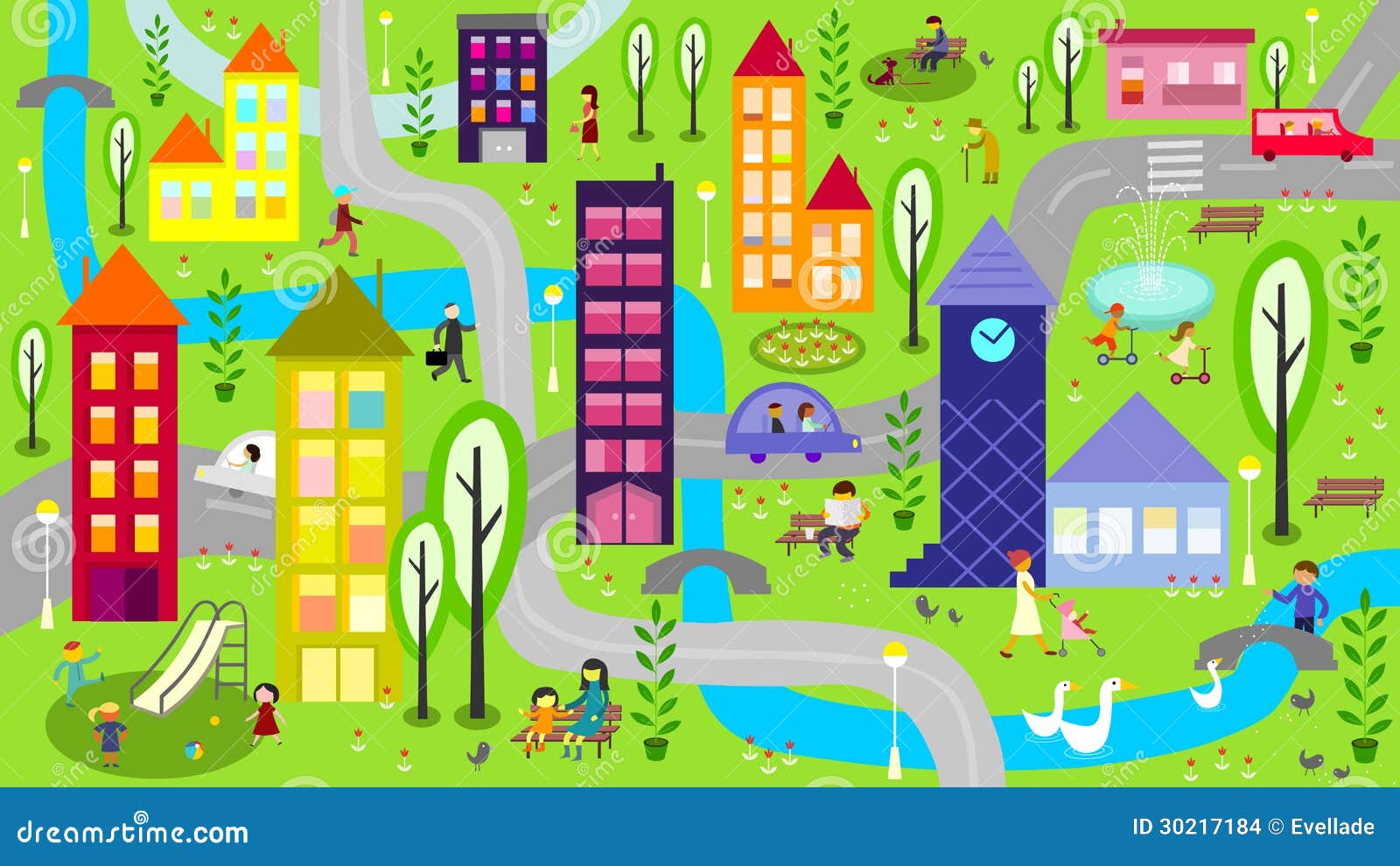
https://www.dreamstime.com/stock-images-illustration-represents-colorful-city-scene-daytime-river-buildings-cars-roads-children-playing-people-image30217184
https://www.123rf.com/profile_brgfx

Here above are some I found, I discovered that a lot of flat images do not put all objects on one horizon line but they can actually have more. Take the first image, for example, it has 4 tiers to its landscape. This helps to make a clear illustration when creating a flat landscape scene.
These flat landscapes can also be great for maps in children's books such as picture 2 above. I like the flat image as it is fun and makes an illustration interesting with lots to look at.
I also understand that colours help a lot with a flat landscape by adding distance to an illustration. For example, using brighter colours in the foreground and fainter colours in the background. This helps to show the atmosphere in the air which creates a sense of distance in a landscape. So even though you are creating a flat landscape, colours can help to create distance in your illustration.
I am now going to look at the sketches that I have done and pick two to redraw with my flat landscape in mind.


I have decided to pick sketches 2 and 6. I like sketch two as I like the idea how there are posts in the mountains which are holding the ropes on the city up. The paragraph does not explain how the ropes are attached to the mountain but I think this is a fun way to view the city. I also like the idea of a sign at the top with the cities name. This is a flat landscape which would work well as an idea.
I really like sketch 6 also. It has a very naive way of looking at the scene which is great for kids. I like the way I have made it simple yet fitted in a lot of the information. I can see this as being a clear and fun way to show the city.


Here above I have sketched them again. After doing this I have decided that I like my illustration 6 best as I feel that I can make it very clear and show all of the items described in the paragraph. It will be a great example of a flat illustration. Also using the correct colours I can give the illusion of distance in my work.
Now I have got my sketches in front of me and the information, I am going to draw my final idea out in fine liner.


Here above is my final fine liner image and I have also scanned it into the computer for my next step. I really like my idea it is straight to the point and is fun to look at. It looks like a children's illustration which I was aiming for. It shows a lot of the items that were detailed in the paragraph given. I am now going to add colour and details using photoshop.
First of all, I usually find the best way to work with a scanned illustration is firstly open it up in Illustrator and use the trace the image tool. This helps to neaten up my lines and also removes the pixel aspect to it. I also find this easier once saved and opened it up in photoshop as its easier with the wand tool to select areas to edit.


Above I have taken some screenshots of my progress I have now traced it and have used the wand to select all the background area to then paint in with sky blues. I am going to use a thick brush tool and a low transparency to make a cool styled texture in my illustration. I haven't tried this way before but thought using layers of paint would look interesting. I think I may also use this style for the main areas of the illustration too if it goes well.


Final Illustration

Conclusion
Here above is my finished illustration. I am really happy with it. I Thought I would try mixing traditional with digital and it has turned out well. I really like the style of the textures I created with the brush tool making colours overlap each other and attempted to not be so neat and fussy about what I was doing. I have followed the brief well by adding in all the elements listed and also by doing my research and looking at other students work helped me to produce something different yet appealing.
I have also added my own little touches such as the shower and the water, showing that a funnel is at the top of the left mountain capturing the rain to flow to the shower head.
It works well as a children's illustration. My drawing and colours work well together creating a fun, interesting and happy landscape.
If I have to be critical of myself I would perhaps say that I could have tried other methods of adding textures in photoshop or maybe did a landscape in a point perspective as I do struggle with it, to try and improve. However, I really wanted to have a go at a flat landscape.
Reflection
Assignment one has been a good assignment to refresh on basic aspects of illustration such as colour
Based on this assignment 1 I feel I have followed the guidelines to the exercises but also used my own style, research experience and my imagination to create good pieces of work for this chapter which are my own unique ideas.
2nd Attempt to Invisible Cities - Assignment 1


Overall and Reflection
2nd Attempt to Invisible Cities - Assignment 1
I received my feedback from my tutor and it really helped me to realise I should just stick to my style of using paper and explore it further - instead of trying other ways. Using paper is fairly new to me and I do love working with it so I am going to stick with it and widen my knowledge of its usage and ways in which it can be used. - I have found that my paper cutting has great potential and my tutor also said that I should have done more in this first assignment showcasing my use of paper.
So today I have decided to reattempt the assignment and create the mountain scene from paper. I have first decided to still use all my research I did and use my final digital illustration as a draft for my paper illustration of the Invisible city scene. I have collected various coloured papers and a small box which will help me to hold the scene in place and give depth to my illustration.
I have looked at my digital illustration and have started to cut out areas such as the two mountains and the hilly landscape in the background. This will form the basic composition of my illustration in the box.
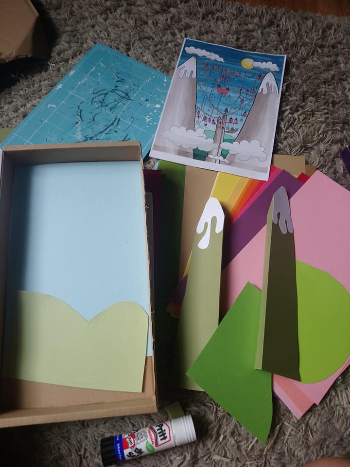

Once stuck inside the box I decided the next thing to do was create the clouds in the sky and start creating the ropes which form the city hanging in-between the mountains. I picked out some brown twine, rope thread and some postal thread - I decided to use the postal thread at it was just the right thickness to it and did not frail at the ends easy like the twine thread did. I started to glue and sellotape the thread behind one mountain and join the other end to the other mountain. I also wanted some of the thread to go round the stump in the middle just like my illustration. I attempted to do this but it kept coming loose around the stump. I decided to cut two slits either side of the stump so that I could wedge in the thread and stop it from moving - it worked well and is now more secure.
I then stuck the sun and clouds into the scene. I have so far been using a glue stick, sellotape and double sided tape to stick it all together. However, one of the mountains came away from the box when I was attatching the string, so decided to use pva glue to attache the mountains instead as it is stronger.


I am really happy with the outcome so far - My tutor was right to point me back into my paper style. I am really enjoying making this and its great fun doing something a bit different with paper. Now I have the main scene inplace I now need to think of adding the details in of the city. There was a lot of things described in the breif to build the idea of the city. I tried to fit them all in in the digital illustration but feel this paper illustration may be a little harder to do because of the space I am trying to work in. I am firstly going to start to make the houses and stick them on to the ropes.
For the houses, I have chosen red paper to keep with the digital illustrations colours. I am going to fold the paper and cut the shapes out . The folded the paper would create two sides which will help to attach them to the rope easier.


Here are the houses above which I am happy with and they look great. I also tried to do flowers in baskets but the way I attached them they just would not sit right and so I have decided to take them off and think of another way to add them.
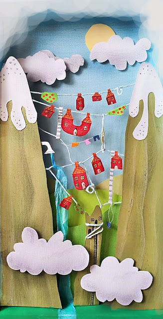
The finished Illustration
I was having so much fun that I forgot to take some more process shots. Here is the finished illustration:


As you can see, I have added a lot for detail now, which includes foilege (I decided to do bushes instead of flower baskets as it worked better attaching them on the ropes) I created hoops with the thread for the childrens games. I also added ladders, a washing line, a swing and a working shower. I really liked the shower and I used tissue paper for the water effect and made it flow down in to a river below.


This photo I took shows the depth at am angle so you can see the depth in the illustration I created.

I then decided to put my illustrationa and see if I can make it better in photoshop:

I added extra clouds at the top, made areas lighter and added more dark areas to extend the depth and finally used the sharpen tool to make it more appealing to the eye. I think I do need a really good camera to improve capturing my paper illustrations as it stil is a bit blurey.
I am so happy I re-attempted this assignment and I enjoyerd it more the second time round. I think my illusration is still aimed at a childrems as its bright, playful and has a happy vibe to it. I think my favourite part was making the shower with the water and attaching the ropes. It was really fun to do.
If I was to be critical on the new illustration, I would say that I should have used smooth coloured paper as the paper I used has a linen texture to it making it difficult to add on colour and show different textures without the texture of the paper getting in the way.
In regards to creating the illustration I find myself asking these questions: Could I have been better off with a bigger box? so that I could add in more detail? or could have created it without the box and have it all displayed on top of a table and took photos at certain angles to capture the finished illustration? - It's all useful ideas to think of for future illustrations - Paper is a medium which I believe there are so many ways to use it so its great to keep experimenting ideas that come to me.
I now have two peices for this assignment and both have helped me learn a lot and also its great to show how much I love experimenting.
Comments
Post a Comment